CSS 픽셀 크기는 어떻게 계산됩니까?
CSS 단위를 조사하는 동안 참조 픽셀의 정의를 접했습니다. 그러나 CSS 픽셀 단위와의 관계에 대한 일관되고 포괄적 인 설명을 찾을 수 없었습니다. 나는이 문제에 대해 약간의 조사를했지만 여전히 나에게는 약간 불분명하다.
1. 수집 된 정보
1.1 픽셀 정의
픽셀에는 두 가지 유형 / 정의가 있습니다.
"장치 픽셀" — 디스플레이의 단일 물리적 지점.
과:
CSS 픽셀 — 참조 픽셀과 가장 근접하게 일치하는 단위입니다. [ 1 ]
같은 이름으로 된 두 개의 병렬 개념은 혼란을 명확히하지 않습니다. 나는 두 번째 것을 소개하는 목적을 완전히 이해하고 있지만 그 명칭이 오해의 소지가 있다고 생각합니다. CSS 픽셀은 절대 단위로 분류되며 다음과 같습니다.
"절대 길이 단위는 서로에 대해 고정되어 있습니다." [ 1 ]
위의 진술은 픽셀을 제외한 모든 단위에 대해 매우 분명해 보입니다. w3c 사양을 따름 :
"CSS 장치의 경우 이러한 치수는 (i) 물리적 단위를 물리적 측정에 연결하거나 (ii) 픽셀 단위를 참조 픽셀에 연결하여 고정됩니다.
(...) 앵커 단위가 픽셀 단위 인 경우 물리적 단위가 물리적 측정과 일치하지 않을 수 있습니다. 또는 앵커 단위가 물리적 단위 인 경우 픽셀 단위가 전체 장치 픽셀 수에 매핑되지 않을 수 있습니다. "[ 1 ]
앞서 언급 한 인용문을 고려하면 절대 단위가 참조 픽셀에 고정 될 수 있으므로 절대 단위가 그다지 절대적이지 않다고 가정합니다.
1.2 참조 픽셀
참조 픽셀 자체는 실제로 각도 측정 [ 2 ]입니다.
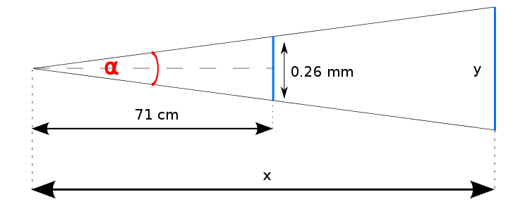
"참조 픽셀은 픽셀 밀도가 96dpi이고 판독기에서 팔 길이의 거리를 가진 기기에서 한 픽셀의 시각 각도입니다. 따라서 명목 팔 길이가 28 인치 인 경우 시각 각도는 약 0.0213 도입니다." [ 1 ]
아래 이미지에 표시된 내용 :
참조 픽셀을 시각적 각도로 정의 했음에도 불구하고 다음을 더 읽을 수 있습니다.
"팔 길이로 읽을 때 1px는 약 0.26mm (1/96 인치)에 해당 합니다."
불일치를 제쳐두고 각도 값을 설정할 수 있습니다.
α = 2 * arctan(0.026/142) = 0.02098°

where:
    α — a value of the visual angle
따라서 표시되는 단위의 크기는 다음과 같습니다.
y = 2x * tan(0.01049°)

where:
    y — a displayed unit size
    x — a reading distance
위의 공식에서 단위 크기를 계산하려면 실제 판독 거리를 결정해야합니다. 사용자마다 다를 수 있으므로 분류는 장치의 DPI를 기반으로합니다.
1.2.1 DPI
편의상 DPI == PPI.
이 측정을 통해 디스플레이 유형을 추측 할 수 있습니다. 빠른 확인:
- iPhone 6 ( 4.7 인치 , 1334x750) : 326ppi ;
- Sony Bravia 4K (54.6", 3840×2160): 75 ppi.
So, in general, the bigger PPI the closer to a screen a user sits. The table below [3] presents reading distance recommendations for devices with particular DPI:
               ———————————————————————————————————————
              |  DPI  | Pixel size | Reading distance |
 —————————————————————————————————————————————————————
|PC's CRT     |  96   | ~0.2646 mm |     ~71 cm       |
|display      |       |            |                  |
 —————————————————————————————————————————————————————
|Laptop's LCD |  125  | 0.2032 mm  |     ~55 cm       |
|display      |       |            |                  |
 —————————————————————————————————————————————————————
|Tablet       |  160  | ~0.159 mm  |     ~43 cm       |
 —————————————————————————————————————————————————————
However, it's unclear to me how those distance values were obtained. Is the relation to DPI described with a function or is it just an empirical observation?
1.2.2 Device Pixel Ratio
The introduction of the Retina display complicated the matter even further. Its PPI tends to be approximately 2 times bigger than non-Retina one's, while a recommended reading distance should remain the same. Since a CSS pixel size doesn't necessarily correspond with a device pixel size, I assume that the unit size on the Retina display is firstly translated into a reference pixel size (expressed in device pixels) and then multiplied by pixel ratio. Is it correct?
1.2.3 Zooming
While zooming in, the displayed reference pixel size grows [4], ergo a distance from a display grows. It's quite counterintuitive, because it means that we are "stepping away" from the screen, not getting closer to it.
2. Questions
Concluding my doubts and articulating questions:
- How a CSS pixel size is calculated when the anchor unit is a physical unit?
- How to establish the formula for a relation between DPI and a reading distance?
- How a CSS pixel size is calculated for non-standard, high DPI/PPI devices such as printers and Retina Displays?
Also, please correct me if my reasoning is invalid or I am missing something. Thanks for replies.
3. References
- W3C Specification
- inamidst.com, Sean B. Palmer's site
- Mozzilla Hacks
- 1uirksmode.org
I may be wrong but I don't think it's possible for CSS pixel to have the physical unit as an anchor.
Based on this article:
The px unit is the magic unit of CSS. It is not related to the current font and also not related to the absolute units. The px unit is defined to be small but visible, and such that a horizontal 1px wide line can be displayed with sharp edges (no anti-aliasing). What is sharp, small and visible depends on the device and the way it is used: do you hold it close to your eyes, like a mobile phone, at arms length, like a computer monitor, or somewhere in between, like a book? The px is thus not defined as a constant length, but as something that depends on the type of device and its typical use.
UPDATE: I was wrong. It is possible just not implemented in any browser currently. In cases where that is indeed the case, as per spec: "these dimensions are either anchored (i) by relating the physical units to their physical measurements" meaning that 1px will be equal to 1/96th of a physical inch.
As for the relation between DPI and reading distance in the table, it takes that if DPI = 96 then reading distance is ~71cm or 28in and these values are inversely proportional meaning higher DPI will result in a smaller reading distance.
From that it's easy to come up with a formula:
x = 125/96

y = 71/x

where:
  x - ratio between second and first DPI value
  y - reading distance for second DPI value
For higher resolution devices there is an example given lower in Mozilla Hacks article:
Let’s take iPhone 4 as the most famous example. It comes with a 326 DPI display. According to our table above, as a smartphone, it’s typical viewing distance is 16.8 inches and it’s baseline pixel density is 160 DPI. To create one CSS pixel, Apple chose to set the device pixel ratio to 2, which effectively makes iOS Safari display web pages in the same way as it would on a 163 DPI phone.
So that means we have two resolutions - physical (PPI) and CSS one (cssppi). It seems that cssppi is used for calculating reference pixel size and then device manufacturers choose how much reference pixels will they map to one CSS pixel (I assume this number is equal to device pixel ratio value but not 100% sure).
Here's table with comparisons for some common devices pixel ratio, PPI, and cssppi: http://mydevice.io/devices/
자세한 정보 및 참조는 다음 기사를 확인하십시오.
참조 URL : https://stackoverflow.com/questions/27382331/how-a-css-pixel-size-is-calculated
'Nice programing' 카테고리의 다른 글
| Spring Boot에서 "기본 보안 암호 사용"제거 (0) | 2021.01.09 |
|---|---|
| 기기에서 Firebase 클라우드 메시징 알림을받지 못함 (0) | 2021.01.09 |
| buildozer를 사용하여 Android 용 numpy 라이브러리로 Kivy 패키징 오류 (0) | 2021.01.08 |
| RecyclerView는 NestedScrollView 내에서 사용할 때 뷰를 재활용하지 않습니다. (0) | 2021.01.08 |
| Symfony 애플리케이션의 교리 엔티티 및 비즈니스 로직 (0) | 2021.01.08 |